Section 07 Intermediate
Python: xarray
“
Xarray(formerly xray) is an open source project and Python package that makes working with labelled multi-dimensional arrays simple, efficient, and fun!” -Xarraydocument.
Prerequisites
In Anaconda Powershell, install netCDF4,
xarray, and nc-time-axis, one after
another:
To test whether your environment is set up properly, try the following imports:
Introduction to xarray
In last
section, we saw how pandas handled tabular
datasets, by using “indexes” for each row and labels for each column.
These features, together with pandas’ many useful routines
for all kinds of data wrangling and analysis, have made
pandas one of the most popular python packages in the
world.
However, not all Earth science datasets easily fit into the “tabular”
model (i.e. rows and columns) imposed by pandas. In
particular, we often deal with multidimensional data. By
multidimensional data (also often called N-dimensional), it means data
with many independent dimensions or axes. For example, we might
represent Earth’s surface temperature T as a three dimensional
variable:
\[T(Lon, Lat, Time) \]
The point of xarray is to provide pandas-level
convenience for working with this type of data. Specifically,
xarray is for working with labeled, multi dimensional
arrays.
Built on top of
numpyandpandasBrings the power of
pandasto multidimensional arraysSupports data of any dimensionality

Xarray basics
Like we did for pandas in Section
06, here we will go over the basic capabilities of
xarray. Please dig into the xarray
documentation for more advanced usage.
xarray data structures
Xarray has two fundamental data structures:
a DataArray, which holds a single multi-dimensional variable and its coordinates
a Dataset, which holds multiple variables that potentially share the same coordinates
Check Data Structures for more.
DataArray
A DataArray has four essential attributes:
values: anumpy.ndarrayholding the array’s valuesdims: dimension names for each axis (e.g., (‘x’, ‘y’, ‘z’), (‘lon’, ‘lat’, ‘time’))coords: a dict-like container of arrays (coordinates) that label each point (e.g., 1-dimensional arrays of numbers, datetime objects or strings)attrs: anOrderedDictto hold arbitrary metadata (attributes)
Let’s start by constructing some DataArrays manually:
import numpy as np
import pandas as pd
import xarray as xr
from matplotlib import pyplot as plt
%matplotlib inline
A simple DataArray without dimensions or coordinates
isn’t much use:
You can add a dimension name to the DataArray:
But things get most interesting when you add a coordinate:
# Add a coordinate
da = xr.DataArray([1, 2, 3, -1, 2],
                  dims=['x'],
                  coords={'x': [10, 20, 30, 40, 50]})
da
You can use xarray built-in plotting:
Datasets
A Dataset holds many DataArrays which
potentially can share coordinates. In analogy to
pandas:
Constructing Datasets manually is a bit more involved in terms of
syntax. The Dataset takes three arguments:
data_varsshould be a dictionary with each key as the name of the variable and each value as one of:- A
DataArrayor Variable - A tuple of the form
(dims, data[, attrs]), which is converted into arguments for Variable - A
pandasobject, which is converted into aDataArray - A 1D array or list, which is interpreted as values for a one dimensional coordinate variable along the same dimension as it’s name
- A
coordsshould be a dictionary of the same form asdata_varsattrsshould be a dictionary
For the rest of Section, we will use an output file
(CESM2_200001-201412.nc) from the Community Earth System
Model (CESM) to show basics of xarray and how to handle
Dataset files. The file contains global monthly near
surface temperature from 2000 to 2014. Please
download the file, and move it to your working directory.
Loading data from a netCDF file
In fact, Xarray’s interface is heavily inspired by the
netCDF data model. And xarray’s
Dataset is designed as an in-memory representation of a
netCDF dataset.
First, let’s open the CESM netCDF file
(CESM2_200001-201412.nc) using the
xarray.open_dataset() function:
By default, xarray.open_dataset() function uses lazy
loading, i.e. it just loads in the coordinate and
attribute metadata and not the data that correspond to data
variables themselves. The data variables are loaded only on actual
values access (e.g. when performing some calculation, slicing, …) or
with .load() method. The xarray.open_dataset()
is also able to load files in other formats (e.g., grib,
tiff, or zarr), check Reading
and writing files for more.
Now take a look at the loaded dataset:
To check the corresponding netCDF representation, we can use the
.info() method:
Checking Datasets properties
The Datasets (ds) have the following key
properties:
data_vars: an dictionary ofDataArrayscorresponding to data variablesdims: a dictionary mapping from dimension names to the fixed length of each dimension (e.g. {‘time’:180, ‘lat’:192, ‘lon’:288, ‘nbnd’:2} )coords: a dictionary-like container of arrays (coordinates) that label each point (tick label) along our dimensionsattrs: a dictionary holding arbitrary metadata pertaining to the dataset
Check those one by one:
Checking DataArray properties
As we just covered, the DataArray is
xarray’s implementation of a labeled, multi-dimensional
array. It has several key properties:
data: an array (numpy.ndarray,dask.array, orsparseorcupy.arrayholding the array’s values).dims: dimension names for each axis e.g. (lat, lon, time)coords: a dictionary-like container of arrays (coordinates) that label each point (tick label) along our dimensionsattrs: a dictionary that holds arbitrary attributes/metadata (such as units).name: an arbitrary name of the array
For example, you can use ds['tas'] to extract the
tas (near surface temperature) variable
(DataArray), and later check its properties one by one:
Indexing and selecting data
Xarray supports two kinds of indexing:
Positional indexing via
.isel(): provides primarily integer position based index (from0tolength-1of the axis/dimension)Label indexing via
.sel(): provides primarily label based index.
The good part of xarray is that, its indexing methods
preserves the coordinate labels and associated metadata.
Check Indexing and selecting data for more.
Selection by position
The .isel() method is the primary access method for
purely integer based indexing. The following are valid
inputs:
An integer, e.g.
lat=10A list or array of integers, e.g,
lon=[10, 20, 39]A slice object (range) with integers, e.g.
time=slice(2, 20)
Selection by label
The .sel() method is the primary access method for
purely coordinate label based indexing. The following
are valid inputs:
A single coordinate label, e.g.
time='2013-01-15'ortime='2013'A list or array of coordinate labels, e.g.
lon=['100','356.25']A slice object with coordinate labels, e.g.
time=slice("2021-01-01", "2021-03-01")
Nearest-neighbor lookups
Now try:
Can you figure out why this did not work?
Be careful when working with floating coordinate labels. When we have
integer, string, datetime-like values for coordinate labels,
sel() works flawlessly. When we try to work with floating
coordinate labels, things get a little tricky. As shown above, when our
coordinate labels are not integers or strings or datetime-like but
floating point numbers, .sel() may throw a KeyError:
ds.tas.sel(lat=39.5, lon=105.7) fails because we are trying
to use a conditional for an approximate value, i.e
floating numbers are represented approximately inside the computer, and
xarray is unable to locate this exact value. To address
this issue, xarray supports method and tolerance keyword
argument. The method parameter allows for enabling nearest neighbor
(inexact) lookups by use of the methods pad,
backfill, or nearest:
So the closest location in the data was at
lat=39.11, lon=106.2.
See the xarray
documentation for more on usage of method and tolerance parameters
in .sel().
Another way to use the nearest neighbor lookup is via a objects. For example:
# Using the slice method to find a nearby value
ds.tas.sel(lat=slice(39, 39.5), lon=slice(106.1, 106.3))
Operators can be chained, so multiple operations can be used sequentially. For example, to select an area of interest and the first time index, and plot the data:
Basic plotting with .plot()
Xarray provides a .plot() method on
DataArray and Dataset. This method is a
wrapper around Matplotlib’s
matplotlib.pyplot.plot(). xarray will
automatically guess the type of plot based on the dimensionality of the
data. By default .plot() creates:
a line plot for 1-D arrays using
matplotlib.pyplot.plot()a pcolormesh plot for 2-D arrays using
matplotlib.pyplot.pcolormesh()a histogram for everything else (more than 2 dimensions) using
matplotlib.pyplot.hist()
Histograms
1D line plots
Let’s select one spatial location and plot a time series of the near surface temperature:
# Time series of the near surface temperature at Shenzhen
ds.tas.sel(lon=294.1, lat=22.5, method='nearest').plot(marker="o", size=6)
plt.show()
Lets say we want to compare plots of temperature at three different
latitudes. We can use the hue keyword argument to do
this.
2D plots
Operator chaining means it is possible to have multiple selection
operators and add .plot() to the end to visualize the
result.
# 2D map over lat (-80,25) and lon (20,160) at timestamp -10
ds.tas.isel(time=-10).sel(lon=slice(20, 160),
                          lat=slice(-80, 25)).plot(robust=True, figsize=(8, 6))
plt.show()
The x- and y-axes are labeled with full names — “Latitude”, “Longitude” — along with units. The colorbar has a nice label, again with units. And the title tells us the timestamp of the data presented.
You can, of course, modify the color bar:
# Define keyword arguments that are passed to matptolib.pyplot.colorbar
colorbar_kwargs = {
    "orientation": "horizontal",
    "label": "my clustom label",
    "pad": 0.1,
}

# Plot
ds.tas.sel(lon=294.1, method='nearest').plot(
    # coordinate to plot on the x-axis of the plot
    x="time",
    # set colorbar limits to 2nd and 98th percentile of data
    robust=True,
    cbar_kwargs=colorbar_kwargs,
)
plt.show()
Faceting
Faceting is an effective way of visualizing variations of 3D data where 2D slices are visualized in a panel (subplot) and the third dimensions is varied between panels (subplots).
# Plot monthly mean near surface temperature in 2010 and 2011, one at a panel
ds.tas.sel(time=slice("2010", "2011")).plot(col="time", col_wrap=6, robust=True)
plt.show()
See the xarray
documentation for more on “faceted” plots or subplots.
Computation
Here we will some basic computation enabled by
xarray.
Arithmetic Operations
Arithmetic operations with a single DataArray
automatically vectorize (like numpy) over all array values.
Let’s convert the air temperature from degree Kelvin to Celsius:
Or even square all values in tas (makes no sense, just
for demonstration):
Aggregation Methods
A very common step during data analysis is to summarize the data in
question by computing aggregations like sum(),
mean(), median(), min(),
max(), in which reduced data provide insight into the
nature of large dataset. Let’s explore some of these aggregation
methods:
Because we specified no dim argument the function was
applied over all dimensions. It is possible to specify a dimension along
which to compute an aggregation. For example, to calculate the mean in
time for all locations specify the time dimension as the dimension along
which the mean should be calculated:
# Calculate the mean in time for all locations
ds.tas.mean(dim='time').plot(size=7, robust=True)
plt.show()
Now try:
# Compute temporal min
ds.tas.min(dim=['time'])
# Compute spatial sum
ds.tas.sum(dim=['lat', 'lon'])
# compute temporal median
ds.tas.median(dim='time').plot(size=7, robust=True)
plt.show()
For more, check xarray
computation.
GroupBy: split, apply, combine
Simple aggregations can give useful summary of our dataset, but often
we would prefer to aggregate conditionally on some
coordinate labels or groups. Xarray provides the so-called
groupby operation which enables the
split-apply-combine workflow on xarray
DataArrays and Datasets. The
split-apply-combine operation is illustrated in this
figure.
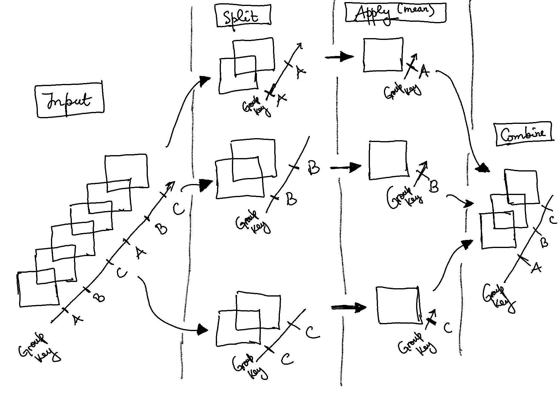
This makes clear what the groupby accomplishes:
The
splitstep involves breaking up and grouping anxarrayDatasetorDataArraydepending on the value of the specified group keyThe
applystep involves computing some function, usually an aggregate, transformation, or filtering, within the individual groupsThe
combinestep merges the results of these operations into an outputxarrayDatasetorDataArray
We are going to use groupby to remove the seasonal cycle
(“climatology”) from our dataset:
# Near surface temperature at Shenzhen
ds.tas.sel(lon=294.1, lat=22.5, method='nearest').plot(marker="o", size=6)
plt.show()
First, let’s group data by month, i.e. all
Januaries in one group, all Februaries in one
group, etc…
Here we are using the .dt DatetimeAccessor
to extract specific components of dates/times in our time coordinate
dimension. You can also try ds.time.dt.year and
ds.time.dt.month, see what happens.
Xarray also offers a more concise syntax when the
variable you’re grouping on is already present in the dataset. This is
identical to ds.tas.groupby (ds.time.dt.month):
Now that we have groups defined, it’s time to “apply” a calculation to the group. These calculations can either be:
aggregation: reduces the size of the group
transformation: preserves the group’s full size
At then end of the apply step, xarray will automatically
combine the aggregated/transformed groups back into a single object.
Let’s calculate the climatology at every point in the dataset and plot the results:
# Calculate the climatology
tas_clim = ds.tas.groupby('time.month').mean()
tas_clim

# Plot climatology at a specific point (Shenzhen)
tas_clim.sel(lon=294.1, lat=22.5, method='nearest').plot()
plt.show()

# Plot zonal mean climatology
tas_clim.mean(dim='lon').transpose().plot.contourf(levels=12, robust=True, cmap='turbo')
plt.show()
Now let’s combine the previous steps to compute climatology and use
xarray’s groupby arithmetic to remove this climatology from
our original data:
# Group data by month
group_data = ds.tas.groupby('time.month')

# Apply mean to grouped data, and then compute the anomaly
tas_anom = group_data - group_data.mean(dim='time')
tas_anom

# Plot anomalies at a specific point (Shenzhen)
tas_anom.sel(lon=294.1, lat=22.5, method='nearest').plot()
plt.show()

# Plot global mean anomalies
tas_anom.mean(dim=['lat', 'lon']).plot()
plt.show()
For more, see GroupBy: split-apply-combine.
Masking Data
Using .where() method, elements of an
xarray Dataset or xarray
DataArray that satisfy a given condition or multiple
conditions can be replaced/masked. Unlike .isel() and
sel() that change the shape of the returned results,
.where() preserves the shape of the original data. It does
accomplishes this by returning values from the original
DataArray or Dataset if the condition is
True, and fills in missing values wherever the
condition is False.
# Select data
sample = ds.tas.isel(time=-1)
sample

# Sample data where temperature is less than 270
masked_sample = sample.where(sample < 270.0)
masked_sample

# Plot 2 panels
fig, axes = plt.subplots(ncols=2, figsize=(19, 6))
sample.plot(ax=axes[0], robust=True)
masked_sample.plot(ax=axes[1], robust=True)
plt.show()
.where() also allows providing multiple conditions. To
do this, we need to make sure each conditional expression is enclosed in
(). To combine conditions, we use the &
operator and/or |. let’s use where to mask locations with
temperature values less than 250 and greater than
300:
# More than one condition
sample.where((sample > 250) & (sample < 300)).plot(size=6, robust=True)
plt.show()

# More than one condition
sample.where((sample.lat < 5) & (sample.lat > -5) & (sample.lon > 190) &
             (sample.lon < 240)).plot(size=6, robust=True)
plt.show()
For more, see Masking with where.
The notes are modified from the excellent Research Computing in Earth Sciences and xarray-tutorial freely available on the GitHub.
In-class exercises
Exercise #1
Go over the notes, make sure you understand the scripts.
Exercise #2
Compute the global mean temperature between 2005-01 and
2010-12.
Exercise #3
Plot the the seasonal cycle (“climatology”) in temperature near your hometown.
Exercise #4
Plot anomalies at your hometown, do you observe a trend?
Exercise #5
Plot monthly climatology in temperature in 12
panels.
Further reading
xarrayoffical guide- NetCDF offical guide
xarrayExample CheatsheetPython: a tutorial introduction toxarray- Pythia Cookbooks Gallery (very comprehensive, contains many courses and tutorials)
- Panoply
(great tool to visualize and check netCDF files, requires
java runtime environment 9)