Section 08 Plotting with
matplotlib
“The simple graph has brought more information to the data analyst’s mind than any other device.” - John Tukey
Prerequisites
# Load modules
import numpy as np
import pandas as pd
import matplotlib as mpl
import matplotlib.pyplot as plt
import matplotlib.gridspec as gridspec
In this section, we will use the daily
ozone data file used for Exercise
#4 in Section 06. To read the data with pandas:
# Read ozone data
import pandas as pd
ozone_data =  pd.read_csv('ozone_data.csv')

# Check the data
ozone_data.head()
Plotting with matplotlib
Matplotlib is the most popular plotting library in
python. Using matplotlib, you can create
pretty much any type of plot. However, as your plots
get more complex, the learning curve can get steeper. The goal of this
section is to make you understand how plotting with
matplotlib works and make you comfortable to build
full-featured plots with matplotlib.
A basic scatterplot
The following piece of code is found in pretty much any python code
that has matplotlib plots.
matplotlib.pyplot is usually imported as
plt. It is the core object that contains the methods to
create all sorts of charts and features in a plot. The
%matplotlib inline is a jupyter notebook specific command
that let’s you see the plots in the notebook itself.
Suppose you want to draw a specific type of plot, say a scatterplot,
the first thing you want to check out are the methods under
plt (type dir(plt)). Let’s begin by making a
simple but full-featured scatterplot and take it from there. Let’s see
what plt.plot() creates if you an arbitrary sequence of
numbers.
# This will return the plot object itself (0x22172dfec10)
# besides drawing the plot.
plt.plot(ozone_data['Ozone'])
This draws a line automatically, assuming the values of the X-axis to
start from zero going up to as many items in the data. Notice the line
matplotlib.lines.Line2D in code output, this is because
matplotlib returns the plot object itself besides drawing
the plot. If you only want to see the plot, add one more line:
Here plt.plot draws a line plot by default. To make a
scatterplot, you need to understand a bit more about what arguments
plt.plot() takes. The plt.plot accepts
3 basic arguments in the following order: (x, y,
format). And the format is a shorthand combination
of {color}{marker}{line}. For example, the format
ko- has 3 characters standing for: black
(k) colored dots (o) with a solid line
(-). By omitting the line part (-) in the end,
we will be left with only black dots (ko), which makes it
draw a scatterplot.
For a complete list of colors, markers, and linestyles, check out the
help(plt.plot) command.
A slightly complex scatterplot
Now add more details to the figure:
# Set the figure size
# 8 is width, 5 is height
plt.figure(figsize=(8,5))

# Plot with a label
plt.plot(ozone_data['Ozone'], 'ko', label='Ozone')

# Title, x and y labels, y lim, and legend
plt.title('Daily Ozone')
plt.xlabel('Index')
plt.ylabel('Ozone [ppb]')
plt.ylim(0, 200)
plt.legend(loc='best')

# Show plot
plt.show()
Here we use plt.figure to make a figure. Every
plot that matplotlib makes is drawn on something called
figure. You can think of the figure object as a canvas that
holds all the subplots and other plot elements inside it. And a figure
can have one or more subplots inside it called axes, arranged
in rows and columns. Every figure has at least one axes. Don’t confuse
axes with X- and Y-axis.
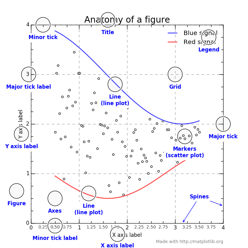
The following figure summaries well about different parts of a figure. We will go over those one by one.
Drawing scatterplots in different panels
Suppose we want to draw Ozone and
Temperature in two separate plots side-by-side. You can do
that by creating two separate subplots, aka, axes
using plt.subplots(1, 2). This creates and returns two
objects:
The figure
The axes (subplots) inside the figure
Previously, we called plt.plot() to draw the points.
Since there was only one axes by default, it drew the
points on that axes itself. But now, since we want the points to be
drawn on different subplots (axes), we have to call the
plot function in the respective axes (ax1 and
ax2 in below code) instead of plt.
# Create Figure and Subplots
fig, (ax1, ax2) = plt.subplots(1,2, figsize=(8,5), sharey=False, dpi=120)

# Plot
ax1.plot(ozone_data['Ozone'], 'go')  # green dots
ax2.plot(ozone_data['Temperature'], 'k*')  # black starts

# Title, X and Y labels, and Y lim
ax1.set_title('Ozone'); ax2.set_title('Temperature')
ax1.set_xlabel('Index'); ax2.set_xlabel('Index')  # x label
ax1.set_ylabel('Ozone [ppb]'); ax2.set_ylabel('Temperature [F]')  # y label
ax1.set_ylim(0, 200); ax2.set_ylim(50, 100)  # y axis limits

# Using a tight layout
plt.tight_layout()
plt.show()
Setting sharey=False in plt.subplots()
means not sharing the Y-axis between the two subplots. And
dpi=120 increased the number of dots per inch of the plot
to make it look more sharp and clear. You will notice a distinct
improvement in clarity on increasing the dpi, especially in jupyter
notebooks.
The ax1 and ax2 objects, like
plt, has equivalent set_title,
set_xlabel and set_ylabel functions. In fact,
the plt.title() actually calls the current axes
set_title() to do the job.
Alternately, to save keystrokes, you can set multiple things in one
go using the ax.set().
# Create Figure and Subplots
fig, (ax1, ax2) = plt.subplots(1,2, figsize=(8,5), sharey=False, dpi=120)

# Plot
ax1.plot(ozone_data['Ozone'], 'go')  # green dots
ax2.plot(ozone_data['Temperature'], 'k*')  # black starts

# Title, X and Y labels, and Y limits
ax1.set(title='Ozone', xlabel='Index', ylabel='Ozone [ppb]', ylim=(0,200))
ax2.set(title='Temperature', xlabel='Index', ylabel='Temperature [F]', ylim=(50,100))

# Using a tight layout
plt.tight_layout()
plt.show()
Matlab like syntax
The syntax we’ve seen is the Object-oriented syntax, which
plot axes one after another. Since the original purpose of
matplotlib was to recreate the plotting facilities of
Matlab in python, the matlab-like-syntax relies on
a global state and a flat name space. For example, the above figure can
be made by:
# Create Figure and Subplots
plt.figure(figsize=(8,5), dpi=120)

# Left hand side plot
plt.subplot(1,2,1)  # (nRows, nColumns, axes number to plot)
plt.plot(ozone_data['Ozone'], 'go')  # green dots
plt.title('Ozone')
plt.xlabel('Index'); plt.ylabel('Ozone [ppb]')
plt.ylim(0, 200)

# Right hand side plot
plt.subplot(1,2,2)
plt.plot(ozone_data['Temperature'], 'k*')  # black starts
plt.title('Temperature')
plt.xlabel('Index'); plt.ylabel('Temperature [F]')
plt.ylim(50, 100)

# Show plot
plt.tight_layout()
plt.show()
The plt.plot() or plt.{anything} will
always act on the plot in the current axes, whereas,
ax.{anything} (object-oriented) will modify the plot inside
that specific ax. Even though the object-oriented version
might look a little confusing because it has a mix of both
ax1 and plt commands, you can avoid writing
repetitive code by looping through the axes. For example, the following
will plot 4 panels:
# Draw multiple plots using for-loops
# using object oriented syntax

# Create Figure and Subplots
fig, axes = plt.subplots(2,2, figsize=(10,6), sharex=True, sharey=False, dpi=120)

# Define the colors, markers, and fields (columns) to use
colors  = {0:'g', 1:'b', 2:'r', 3:'y'}
markers = {0:'o', 1:'x', 2:'*', 3:'p'}
fields  = {0:'Ozone', 1:'Temperature', 2:'Pressure', 3:'Wind.Speed'}

# Plot each axes
for i, ax in enumerate(axes.ravel()):
    ax.plot( ozone_data[fields[i]] , marker=markers[i], color=colors[i])
    ax.set_title(fields[i])

# Plot super title
plt.suptitle('Ozone and meterological data', verticalalignment='bottom', fontsize=16)
plt.tight_layout()
plt.show()
As you can see, the code is much neat now as we use the
object-oriented syntax. Here, the plt.suptitle() adds a
main title at figure level title, and the
verticalalignment='bottom' parameter denotes the
hinge-point should be at the bottom of the title text, so that the main
title is pushed slightly upwards.
Modifying axis ticks and labels
There are 3 basic things you will probably need in
matplotlib when it comes to manipulating axis ticks:
Control the position and tick labels (using
plt.xticks()orax.setxticks()andax.setxticklabels())Control which axis’s ticks (top/bottom/left/right) should be displayed (using
plt.tick_params())Functional formatting of tick labels
If you are using ax syntax (Object-oriented), you can
use ax.set_xticks() and ax.set_xticklabels()
to set the positions and label texts respectively. If you are using the
plt syntax (Matlab-like), you can set both the positions as
well as the label text in one call using the
plt.xticks().
# Set the figure
plt.figure(figsize=(8,5), dpi=100)

# Plot dots
plt.plot(ozone_data['Ozone'], 'go')  # green dots

# Adjust xy axis ticks
plt.xticks(ticks=np.arange(0, 120, 10), fontsize=20, rotation=90, ha='left', va='center')
plt.yticks(ticks=np.arange(0, 200, 50), fontsize=12, rotation=0, ha='right', va='center')

# Tick parameters
plt.tick_params(axis='both', bottom=True, top=True, left=True, right=True,
                direction='out', which='major', grid_color='blue')

# Plot grid lines
plt.grid(linestyle='--', linewidth=0.5, alpha=0.1)

# Add title, \n makes a new line
plt.title('Ozone \n(ppb)', fontsize=14)

# Show plot
plt.show()
Here we have adjusted the label’s fontsize,
rotation, horizontal alignment (ha) and
vertical alignment (va) of the hinge points on the labels,
and plt.tick_params() is used to determine which axis of
the plot (top, bottom, left, or
right) you want to draw the ticks and which direction
(in and out) the tick should point to.
Plotting with a style
Matplotlib comes with pre-built styles which you can
look by typing:
For example, we can use classic, seaborn,
or dark_background for the above plot:
# Use style classic
plt.style.use('classic')
plt.plot(ozone_data['Ozone'], 'go')
plt.show()
# Reset to defaults
mpl.rcParams.update(mpl.rcParamsDefault)

# Use style seaborn-v0_8
plt.style.use('seaborn-v0_8')
plt.plot(ozone_data['Ozone'], 'go')
plt.show()
# Reset to defaults
mpl.rcParams.update(mpl.rcParamsDefault)

# Use style seaborn-v0_8-paper
plt.style.use('seaborn-v0_8-paper')
plt.plot(ozone_data['Ozone'], 'go')
plt.show()
# Reset to defaults
mpl.rcParams.update(mpl.rcParamsDefault)
Besides those pre-built styles, the look of various components of a
matplotlib plot can be set globally using
rcParams. The complete list of rcParams can be
viewed by typing:
You can adjust the params you’d like to change by updating it. For
example, the below snippet adjusts the font by setting it to
stix, which looks great on plots by the way.
# Plot without changing rcParam
plt.plot(ozone_data['Ozone'], 'go')
plt.show()

# Update rcParam and plot
mpl.rcParams.update({'font.size': 18, 'font.family': 'STIXGeneral', 'mathtext.fontset': 'stix'})
plt.plot(ozone_data['Ozone'], 'go')
plt.show()
After modifying a plot, you can rollback the rcParams to
default setting using:
Using colors
Matplotlib also comes with pre-built colors and
palettes. Type the following to check out the available colors.
# View Colors
mpl.colors.BASE_COLORS  # 8 colors
#mpl.colors.TABLEAU_COLORS # 10 colors
#mpl.colors.CSS4_COLORS  # 148 colors
#mpl.colors.XKCD_COLORS  # 949 colors
And use those colors:
# Plot using color: blue from BASE_COLORS
plt.plot(ozone_data['Ozone'], color='b')
plt.show()

# Plot using color: teal from CSS4_COLORS
plt.plot(ozone_data['Ozone'], color='teal')
plt.show()

# Plot using color: light mint green from XKCD_COLORS
plt.plot(ozone_data['Ozone'], color='xkcd:light mint green')

# Show plot
plt.show()
Check List of named colors and xkcd color for more.
Plotting with two Y-axis
You can activate the right hand side Y-axis using
ax.twinx() to create a second axes. This second axes will
have the Y-axis on the right activated and shares the same x-axis as the
original ax. Then, whatever you draw using this second axes
will be referenced to the secondary Y-axis. The remaining job is to just
color the axis and tick labels to match the color of the lines.
# Plot Line1 (Left Y Axis)
fig, ax1 = plt.subplots(1,1,figsize=(8,5), dpi=100)
ax1.plot(ozone_data['Ozone'], color='g')

# Plot Line2 (Right Y Axis)
# Instantiate a second axes that shares the same x-axis
ax2 = ax1.twinx()
ax2.plot(ozone_data['Temperature'], color='b')

# Set axis
# ax1 (left y axis)
ax1.set_ylabel('Ozone [ppb]', color='g', fontsize=15)
ax1.tick_params(axis='y', rotation=0, labelcolor='g')

# ax2 (right Y axis)
ax2.set_ylabel('Temperature [F]', color='b', fontsize=15)
ax2.tick_params(axis='y', labelcolor='b')

# Set title
ax2.set_title("Daily ozone and temperature", fontsize=15)

# Show plot
plt.show()
Customising the legend
The most common way to make a legend is to define the label parameter
for each of the plots and finally call plt.legend().
However, sometimes you might want to construct the legend on your own.
In that case, you need to pass the plot items you want to draw
the legend for and the legend text as parameters to
plt.legend() in the following format:
# Plot with default legend
plt.figure(figsize=(8,5), dpi=100)
plt.plot(ozone_data['Ozone'],'go', label='Ozone')
plt.plot(ozone_data['Temperature'], 'k*', label='Temperature')
plt.legend(loc='best')
plt.title('Default legend example', fontsize=18)
plt.show()

# Plot with custom legend example
plt.figure(figsize=(8,5), dpi=100)
myplot1 = plt.plot(ozone_data['Ozone'], 'go')
myplot2 = plt.plot(ozone_data['Temperature'], 'k*')
plt.title('Custom legend example', fontsize=18)

# Modify legend
plt.legend([myplot1[0], myplot2[0]],       # plot items
           ['Ozone', 'Temperature'],       # legends
           frameon=True,                   # legend border
           framealpha=1,                   # transparency of border
           ncol=2,                         # num of columns
           shadow=False,                   # shadow on
           borderpad=1,                    # thickness of border
           title='Ozone and temperature ') # title

# Show plot
plt.show()
Adding texts, arrows, and annotations
plt.text and plt.annotate adds the texts
and annotations respectively. If you have to plot multiple texts you
need to call plt.text() as many times, typically in a
for loop. Let’s annotate the peaks and troughs adding
arrowprops and a bbox for the text.
# Texts, Arrows and Annotations Example
plt.figure(figsize=(8,5), dpi=100)
plt.plot(ozone_data['Ozone'],'go', label='Ozone')

# Annotate with Arrow Props and bbox
plt.annotate('Peaks', xy=(77, 165), xytext=(90, 150),
             bbox=dict(boxstyle='square', fc='green', linewidth=0.1),
             arrowprops=dict(facecolor='black', shrink=0.01, width=0.1),
             fontsize=12, color='white', horizontalalignment='center')

# Texts at Peaks and Troughs
for index in [10, 60, 110]:
    plt.text(index, -25, str(index) + "\n days",
             transform=plt.gca().transData, horizontalalignment='center', color='blue')

for index in [20, 70, 120]:
    plt.text(index, 0, str(index) + "\n days",
             transform=plt.gca().transData, horizontalalignment='center', color='red')

# Set xy limit
plt.gca().set(ylim=(0, 180), xlim=(0, 120))

# Add titile
plt.title('Daily Ozone', fontsize=18)

# Show plot
plt.show()
Notice, all the text we plotted above was in relation to the data.
That is, the x and y position in the
plt.text() corresponds to the values along the
x and y axes.
However, sometimes you might work with data of different scales on
different subplots, and you want to write the texts in the same position
on all the subplots. In such case, instead of manually computing the
x and y positions for each axes, you can
specify the x and y values in relation to
the axes (instead of X and Y axis
values). You can do this by setting transform=ax.transData.
The lower-left corner of the axes has (x,y) = (0,0) and the
top-right corner will correspond to (x,y) = (1,1).
The below plot shows the position of texts for the same values of
(x,y) = (0.5, 0.05) with respect to the
Data(transData), Axes(transAxes), and
Figure(transFigure), respectively.
# Texts, Arrows and Annotations Example
plt.figure(figsize=(8,5), dpi=100)
plt.plot(ozone_data['Ozone'],'go', label='Ozone')

# Text Relative to DATA
plt.text(0.5, 0.05, "Text1 ", transform=plt.gca().transData,
         fontsize=14, ha='center', color='blue')

# Text Relative to AXES
plt.text(0.5, 0.05, "Text2", transform=plt.gca().transAxes,
         fontsize=14, ha='center', color='red')

# Text Relative to FIGURE
plt.text(0.5, 0.05, "Text3", transform=plt.gcf().transFigure,
         fontsize=14, ha='center', color='orange')

# Set xy limit
plt.gca().set(ylim=(0, 180), xlim=(0, 120))

# Add titile
plt.title('Daily Ozone', fontsize=18)

# Show plot
plt.show()
Setting subplots layout
Matplotlib provides two convenient ways to create
customized multi-subplots layout: plt.subplot2grid() and
plt.GridSpec(). Both let you draw complex layouts. For
example:
# Supplot2grid approach
# Object-oriented syntax

# Set the subgrids
fig = plt.figure(figsize=(10,6),dpi=120)
ax1 = plt.subplot2grid((3,3), (0,0), colspan=2, rowspan=2) # topleft
ax2 = plt.subplot2grid((3,3), (0,2), rowspan=3)            # right
ax3 = plt.subplot2grid((3,3), (2,0))                       # bottom left
ax4 = plt.subplot2grid((3,3), (2,1))                       # bottom right

# Define the colors, markers, and fields (columns) to use
colors = {0:'g', 1:'b', 2:'r', 3:'y'}
markers = {0:'o', 1:'x', 2:'*', 3:'p'}
fields = {0:'Ozone', 1:'Temperature', 2:'Pressure', 3:'Wind.Speed'}

# Plot each axes
ax1.plot(ozone_data[fields[0]] , marker=markers[0], color=colors[0])
ax1.set_title(fields[0])

ax2.plot(ozone_data[fields[1]] , marker=markers[1], color=colors[1])
ax2.set_title(fields[1])

ax3.plot(ozone_data[fields[2]] , marker=markers[2], color=colors[2])
ax3.set_title(fields[2])

ax4.plot(ozone_data[fields[3]] , marker=markers[3], color=colors[3])
ax4.set_title(fields[3])

# Plot super title
plt.suptitle('Ozone and meterological data', verticalalignment='bottom', fontsize=16)
plt.tight_layout()

# Show plot
plt.show()
Using plt.GridSpec, you can use either a
plt.subplot() interface which takes part of the grid
specified by plt.GridSpec(nrow, ncol):
# GridSpec Approach
# Matlab-like syntax

# Set the subgrids
fig = plt.figure(figsize=(10,6), dpi=120)
grid = plt.GridSpec(3, 3)  # 3 rows 3 cols

# Plot each axes
plt.subplot(grid[0:2, 0:2])  # top left
plt.plot(ozone_data[fields[0]] , marker=markers[0], color=colors[0])
plt.title(fields[0])

# Plot each axes
plt.subplot(grid[0:3, 2])   # top right
plt.plot(ozone_data[fields[1]] , marker=markers[1], color=colors[1])
plt.title(fields[1])

# Plot each axes
plt.subplot(grid[2, 0])  # bottom left
plt.plot(ozone_data[fields[2]] , marker=markers[2], color=colors[2])
plt.title(fields[2])

# Plot each axes
plt.subplot(grid[2, 1])  # bottom right
plt.plot(ozone_data[fields[3]] , marker=markers[3], color=colors[3])
plt.title(fields[3])

# Plot super title
plt.suptitle('Ozone and meterological data', verticalalignment='bottom', fontsize=16)
plt.tight_layout()

# Show plot
plt.show()
Using plt.scatter
Matplotlib provides many built-in
functions. Here we use plt.scatter() as an example to
get a sense of what inputs a certain function may expect.
# Plot
plt.figure(figsize=(8,5), dpi=100)

# Scatter plot
plt.scatter('Temperature', 'Wind.Speed', data=ozone_data,
            s='Ozone', c='Pressure', cmap='Reds',
            edgecolors='black', linewidths=0.5)

# Title
plt.title("Bubble Plot of Wind speed vs Temperature\n(color: 'Pressure', size: 'Ozone')",
          fontsize=16)

# xy lables
plt.xlabel('Temperature [F]', fontsize=18)
plt.ylabel('Wind speed [m/s]', fontsize=18)

# Show colorbar
plt.colorbar()

# Save the figure
# Make sure this line goes before plt.show()
plt.savefig("bubbleplot.png", transparent=False, dpi=100)

# Show plot
plt.show()
Here, by varying the size and color of points, we create nice-looking
bubble plots. Another convenience is you can directly use a
pandas dataframe to set the x and
y values, specifying the source dataframe in the data
argument. You can also set the color c and size
s of the points from one of the dataframe columns
itself.
Remember, always use help() to teach yourself how to use
a function.
Beyond matplotlib
As the plots get more complex, the more the code you need to write.
This is the time to consider using a higher level package like
seaborn, and use one of its pre-built functions. We are not
going in-depth into seaborn. A lot of
seaborn’s plots are suitable for data analysis and the
library works seamlessly with pandas dataframes. Like
matplotlib, seaborn comes with its own set of
pre-built styles and palettes. Feel free to go to the official seaborn
page for good examples for you to start with.
So far, we have covered the syntax and
overall structure of creating matplotlib
plots, seen how to modify various components of a plot, customized
subplots layout, plots styling, colors, palettes, etc.
A good way to learn plotting is to browse plots (and scripts!) in the graph galleries. Find the plots you want to mimic, edit and customize the scripts based on your need.
The notes are modified from the excellent Matplotlib Tutorial – A Complete Guide to Python Plot with Examples.
In-class exercises
Exercise #1
Make a plot with 6 subplots (panels), and create the
following figures in those subplots one by one:
a scatter plot between
OzoneandPressure(tryplt.scatter())step chart of
Ozone(tryplt.step())bar chart of
Ozone(tryplt.bar())box plot of
Ozone(tryplt.boxplot())histogram of
Ozone(tryplt.hist())time series of
Ozone
Exercise #2
Plot a violin plot to show Ozone in different
months. Check statistics
example code: boxplot_vs_violin_demo.py for demos.
Exercise #3
Plot a Hexbin
plot with marginal distributions between Ozone and
Temperature. Check Hexbin
plot with marginal distributions for demos.
Further reading
Guide and notes
Matplotlib: visualization with Python (official guide)Matplotlibcheatsheet (complex version fromMatplotlibofficial Github)Matplotlibcheatsheet (simple version from Data Camp)Matplotlib: plotting (fromscipylecture notes)- Visualization
with
matplotlib(fromPythonData Science Handbook) Matplotlibexternal resources
Gallery
Matplotlibgallery- Top
50
matplotlibvisualizations - The
pythongraph gallery (usingmatplotlib,seaborn, andplotly) - GeoCAT-examples gallery
Seabornexample gallery